This summer, Mozilla along with the Knight Foundation created a contest for encouraging hackers and hacks (me) to assemble online and consider ways to innovate news through technology. I made the cut to the program’s second phase – an online learning lab where some 60-odd creatives and coders were selected to take part in a four week session. Each week included three brilliantly intense, mind-opening lectures along with a weekly homework assignment. Over the course of the learning lab we heard from many experts at the top of their game. Speakers included Evan Hansen, Editor In Chief of Wired.com; Mohamed Nanabhay, Head of New Media at the AlJazeera Network; and Jeff Jarvis, author, professor and director of the interactive journalism program at the City University of New York’s Graduate School of Journalism. See the full list of speakers here. Our final assignment is a software proposal defining how we can make news better by incorporating the tools and technology available to us today. Here’s my idea.
What is it?
The Pop! Index is a real-time analysis of of data from across the web – because the world needs a comprehensive way to see what’s happening right now. Pop! is a visualization tool that collects, interprets and visualizes significant patterns of user activity. It searches for and analyzes user sentiment along with discussion levels around any topic. It also measures media consumption to provide detailed information on what pieces of content people are currently watching, reading, and engaging with.
Why?
We already have tools in place for gaining insight into what folks care about and what they’re searching for. Both Google Trends and Google Analytics provide us with extraordinarily deep wells of related data for mining these correlations and counts. Sites like Alexa provides information on highly-ranked sites with related links, while services like Comscore measure distributed media measurement.
The problem is, these are all one-stop shops that provide hard numbers on things like pageviews and click-thru rates. We need a measurement system that takes note of user discussion and overall sentiment.
The point of Pop! is to measure the larger revolution at work that’s driven by social media. It’s to enable publishers to learn more about their audiences and better serve them through news stories, features, and other services that are just as personalized.
Who’s it for?
The tool is for everyone. It’s an open-source project intended to be available to the public. There is no log-in required unless the user would like to bookmark or bundle items for later. The project is for anyone who would like to discover new information and know where to go for more.
Newsrooms can benefit by having access to information as it happens, while reporters can get the most from a story by easily finding original details and ongoing discussion. New forms of storytelling can be developed – living and breathing news that relies on real-time user activity to drive it’s content as new revelations unfold. Through an API, newsrooms can easily customize and implement their own data visualizations to supplement any story. Journalists can learn more about what people actually like, want, or need, to read.
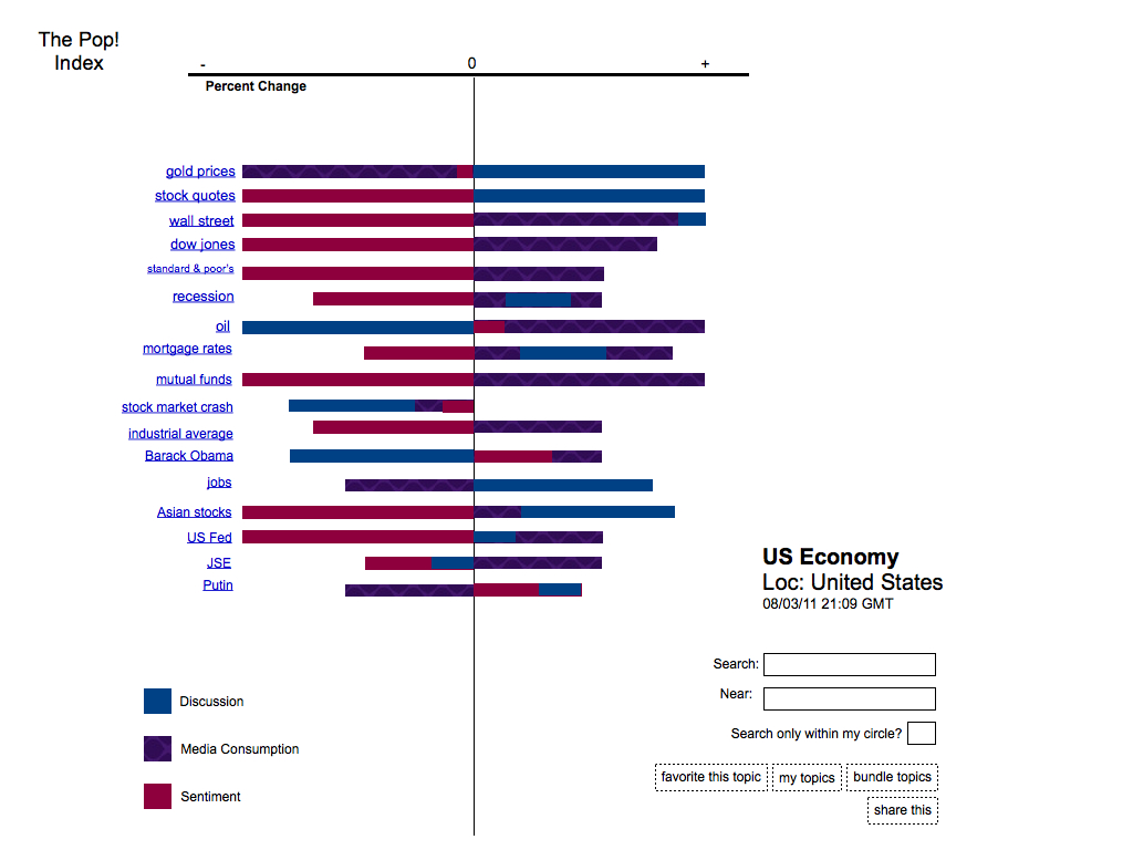
Here’s an example search on the U.S. Economy.

You’ll see that upon doing a search for the U.S. Economy a series of sub-topics appear within the resulting data set. Each sub-topic is categorized according to three primary criteria: discussion, media consumption, and sentiment. The bar at the top indicates the level of activity. Low activity levels are indicated on the left, while high activity levels are indicated on the right.
The user can search for a topic by longitude and latitude, or opt to search for activity happening solely within their social circles.

When a specific criteria is selected, the user has the ability drill down all the way to the very source of the activity. In the example above, we focus on media consumption. In this example, the user can go to the most popular pieces of content related to the subject at hand.
That’s nuts. Is this even possible?
Many sites aggregate data in real-time already. A few include:
http://chartbeat.com
http://luckyorange.com
http://woopra.com
http://clictale.com
Other sites inspired this project. They include:
Twitter search
http://www.ultimatechart.com
http://www.google.com/finance
Google Search API
Some of these existing tools and programs can help us gather, analyze and sort large amounts of online user data. One idea would be to segment the production element into three layers.
1. Base Application which processes and analyzes the data
2. Database Layer
3. User Interface
It’s important to note that the Google Search API can factor in many different analytics, providing unlimited alternative search functions.
(I would absolutely love the opportunity to work out this aspect with some serious hackers in the next level of the #MozLearningLab project in Berlin!)
The core product is designed to be totally open and free (no ads). Future plans to monetize are possible with different tiers in place. One option is to create various level features as the database and logic becomes more robust. This would include advanced iterations for tablet or smartphone. Secondary to that is an API product to license to publishers for use in the newsroom.
Thanks for reading, everyone! I look forward to your thoughts and feedback.
Hi Nicole,
I have a question about the real-time aspect. How would you combine that with something like the visualization presented in the first image? The image shows (if I’m reading the figure correctly) a percentual change according to the horizontal axis. I’m wondering in respect to what this percentual change will be. Compared to a second ago? A minute ago? An hour ago? For smaller intervals, it will feel more real-time, but I fear the bars might fluctuate a lot in size. For larger intervals, it’ll be more stable but less real-time.
Btw, nice video 🙂
Hey there!
The idea is that the percentage will change in smaller intervals, allowing it to be as real-time as possible. You’re right – it may fluctuate a lot in size. Maybe another area should be added where the user can see fluctuations over a certain period of time. Something that was brought to my attention is the bar at the bottom of this page: http://www.google.com/finance, which does something similar but of course in much less detail.
The original idea was to incorporate a ranking system whereby instead of percent change, there were numbers indicating low/negative sentiment vs. high/positive sentiment. The issue there was that it became tricky to represent sentiment on this timeline along with the other criteria. In other words, putting negative sentiment alongside a low amount and a positive sentiment ranked alongside a high amount could get convoluted and a bit confusing.
All in all, having an independent ranking system in place didn’t seem very scalable. Which is why I chose percent change. It could even be swapped out with something like growth depending on what makes the most sense from a development standpoint.
Nice elevator pitch, Nicole. 🙂
Thanks Phillip! It took about 10 takes but was really fun to do. 🙂
I’m impressed as well.
Good thing I got here, I will take this post as very informative. Good job
this is some article
I like this post very much. It is fabulous and effective.
I agree with you.
big problem for the uk which now resembles a city-state with the rest of country as a backwater to London
suchmaschinenoptimierung
Comments are closed.